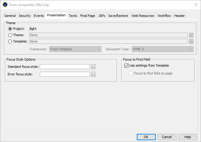
Form Properties – Presentation
Tab
See also: Form Properties Summary, How Style is Applied, Working with Themes, Working with Presentation Templates
The overall style and framework of the Form is configured here.
It is recommended that style choices are added to a Theme and only overwritten by the Form if required. This helps to ensure a consistent style across your application and makes changing the style of your application easy.
|
Property |
Description |
||||
|
Project |
Use the Theme set in the Forms owning Project. If owning Project’s current Theme is modified or the Project is configured to use a new Theme, then the styling in this Form is updated automatically. By selecting the Project’s Theme disables the Theme and Template radio buttons. This is the default and recommended setting for new Forms. |
||||
|
Theme |
Associate this Form with a specific Theme. Hovering the mouse over the name will display the full path to the Theme. Double-clicking on the Theme name will open the Theme’s Presentation Template editor. Clicking the … displays the Workspace Browser dialog and any Theme in the current project or linked Project can be selected. |
||||
|
Template |
Associate this Form with a specific standalone Presentation Template. Hovering the mouse over the name will display the full path. Double clicking on the Template name will open its Presentation Template editor. Clicking the … button displays the Workspace Browser dialog and any Presentation Template in the current or linked Project can be selected. |
||||
|
Framework |
This property is defined in a Theme. If a specific Presentation Template is being used, this Property can be changed. Please note that a Framework usually requires specific styling rules and overriding this property may result in unexpected styling. The name of the styling framework used by this Form or “None”. Changing this property may result in changes to the generated HTML and CSS to suit the styling framework or in changes to the list of available controls and changes to some Control properties – additional features may be displayed to suit the framework. Currently supported Frameworks:
See Using Bootstrap with Verj.io |
||||
|
This property can only be set if the Form is configured to use a Presentation Template. This sets the document type (HTML or XHTML) and the version of HTML or XHTML used:
The default for this parameter is taken from Form Options tab of Designer Preferences. |
|||||
See Controlling Browser Focus for more information on these options. |
|||||
|
Focus to First Field |
See Controlling Browser Focus for more information on these options. |