Next Page Button Control
See also: Ebase Page Sequencing, Styling Assistants, Introduction to Styling, Controls, Page Navigation Panel Control
Description
This is one of the supplied Ebase page navigation buttons. When placed on a page, the button will be displayed when a next page has been configured; when no next page is configured, the button is not displayed. Click here for further details on Ebase page sequencing and behaviour when the user clicks this button.
In the WYSIWYG
View, the toggle hidden controls icon  on the toolbar behaves as follows:
- On: the button is displayed when a next page has been configured (runtime behaviour)
- Off: the button is always displayed
The control can be displayed as a button or
as a clickable image. When displayed as an image, each image is displayed with
a language dependent alternate text taken from system text 10.
Note: A next page button is also included in the Page Navigation Panel Control.
Properties
See also control common properties and local/inherited control properties.
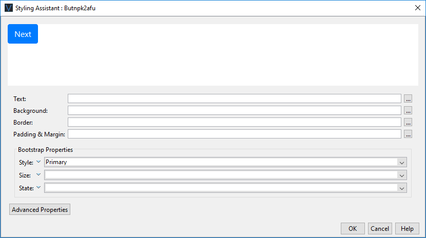
Style Tab – Styling Assistant
|
Property |
Description |
Name1 |
Type1 |
Get1 |
Set1 |
Get/Set Values1 |
|
Text |
Sets the text properties for the button: font, size, color, bold, italic etc. See text properties. |
|
|
|
|
|
|
Background |
Sets the background properties for the button. See background properties. |
|
|
|
|
|
|
Border |
Sets the border properties for the button. See border properties. |
|
|
|
|
|
|
Padding & Margin |
Padding is the space inside the border. Margin is the space beyond the border. See padding and margin properties. |
|
|
|
|
|
|
|
|
|
|
|
|
|
|
Style |
CSS class and inline style for the button. |
cssClass style |
Character |
Yes |
Yes |
As per HTML class parameter As per HTML style parameter |
|
Display As Image |
Indicates that the button is displayed as an image. The image URL is then configured using the Image URL property. |
displayAsImage |
Boolean |
Yes |
Yes |
|
|
Image Url |
Specifies the URL for the image when Display as image is selected. |
imageURL |
Character |
Yes |
Yes |
See URL properties for more information. |
Bootstrap
These properties are only available when a form is configured to use bootstrap i.e. the framework property in Form Properties is configured to use bootstrap (by default this property is inherited from the Presentation Template).
See Using Bootstrap with Verj.io.
|
Property |
Description |
Name1 |
Type1 |
Get1 |
Set1 |
Get/Set Values1 |
|
Style |
Sets the Bootstrap style. This results in the addition of the appropriate bootstrap classes. |
bootstrapStyle |
Character |
Yes |
Yes |
Primary Secondary Success Danger Warning Info Light Dark Link Outline Primary Outline Secondary Outline Success Outline Danger Outline Warning Outline Info Outline Light Outline Dark |
|
Size |
Sets the Bootstrap size. This results in the addition of the appropriate bootstrap classes. |
bootstrapSize |
Character |
Yes |
Yes |
Large Small |
|
State |
Sets the Bootstrap state. This results in the addition of the appropriate bootstrap classes. |
bootstrapState |
Character |
Yes |
Yes |
Active Disabled |
Html Element Properties Tab
This allows you to add element properties to the root element of the Control – see Html Element Properties for more information.
Button tab
|
Property |
Description |
Name1 |
Type1 |
Get1 |
Set1 |
Get/Set
Values1 |
|
Display as image |
Indicates that the button is displayed as an image. The image URL is then configured using the Image URL property. |
displayAsImage |
Boolean |
Yes |
Yes |
|
|
Image URL |
Specifies the URL for the image when Display as image is selected. |
imageURL |
Character |
Yes |
Yes |
See URL properties for more information. |
Texts tab
|
Property |
Description |
Name1 |
Type1 |
Get1 |
Set1 |
Get/Set
Values1 |
|
Next page |
The next page button text. There is only one next page text on each page and this is shared by all Next Page Button Controls on each page. |
|
|
No |
No |
|
1 See accessing control properties from scripts
Examples of setting properties via API based language:
controls.NEXTPAGEBUTTON1.textColor =
"black";
controls.NEXTPAGEBUTTON1.backgroundColor =
"yellow";
Examples of setting properties via FPL:
set
NEXTPAGEBUTTON1.textColor = 'black';
set
NEXTPAGEBUTTON1.backgroundColor = 'yellow';
Right Click Menu Actions
Click here for right-click menu actions available to all controls.
There are no specific right click actions for this control.
Appearance in Outline View
A Next Page Button Control is shown with the control name in brackets: